
Bella Baldwin
December 10, 20242025 Color’s of the Year
Explore the top Colors of the Year for 2025 from leading paint brands like Sherwin Williams, Benjamin Moore, Behr, and more. Discover rich jewel tones, earthy hues, and bold accents that will transform your home's exterior or interior design.
As we step into 2025, paint brands are rolling out their much-anticipated Colors of the Year, showcasing an exciting range of shades that reflect diverse trends and styles. From bold jewel tones to soft neutrals and rich earth-inspired hues, this year’s selections offer something for every design aesthetic. These colors are not just about staying on trend—they’re about setting the mood, enhancing spaces, and making bold statements in both interiors and exteriors. Join us as we explore the standout picks from leading paint brands like Sherwin Williams, Benjamin Moore, Behr, Dunn Edwards, and more, along with ideas on how to incorporate these stunning shades into your home or project.
Sherwin Williams: 2025 Color Capsule
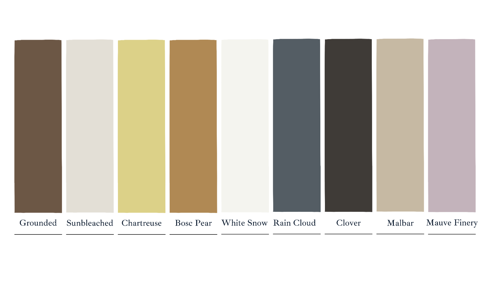 Sherwin Williams is shaking things up this year with a bold new approach: Instead of selecting a single Color of the Year, they created the 2025 Color Capsule—a dynamic collection that sets a new standard for color trends! This curated collection showcases a stunning spectrum, from crisp whites to deep near-blacks, and soft pastels to rich jewel tones. The 2025 Color Capsule has something for everyone.
For interiors, soft neutrals like Sunbleached or Malabar create a warm and inviting foundation that works beautifully in any home, while darker hues like Rain Cloud or Clover add depth and sophistication, perfect for accent walls or cozy spaces.
_1733847489.jpg)
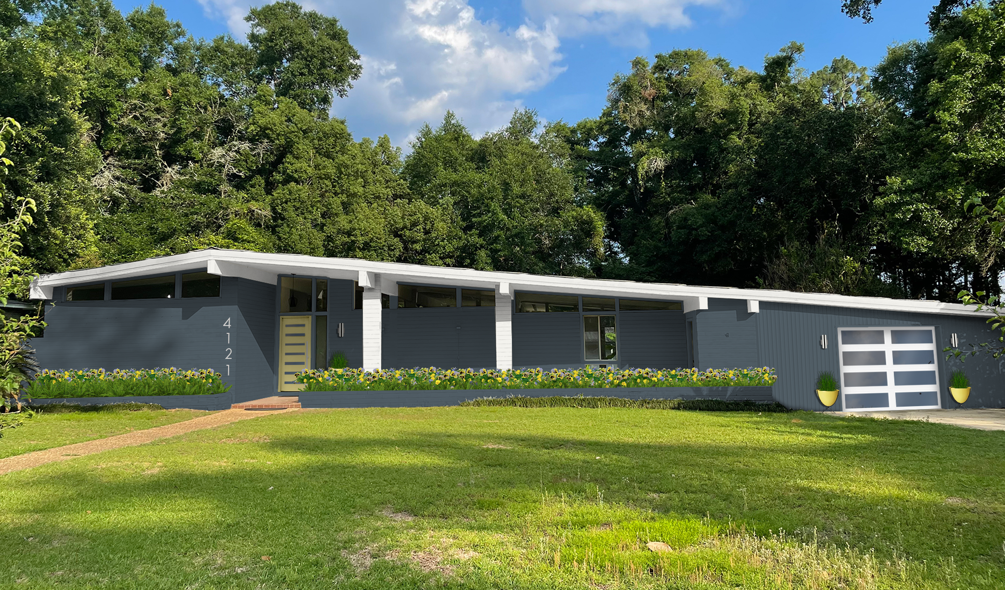
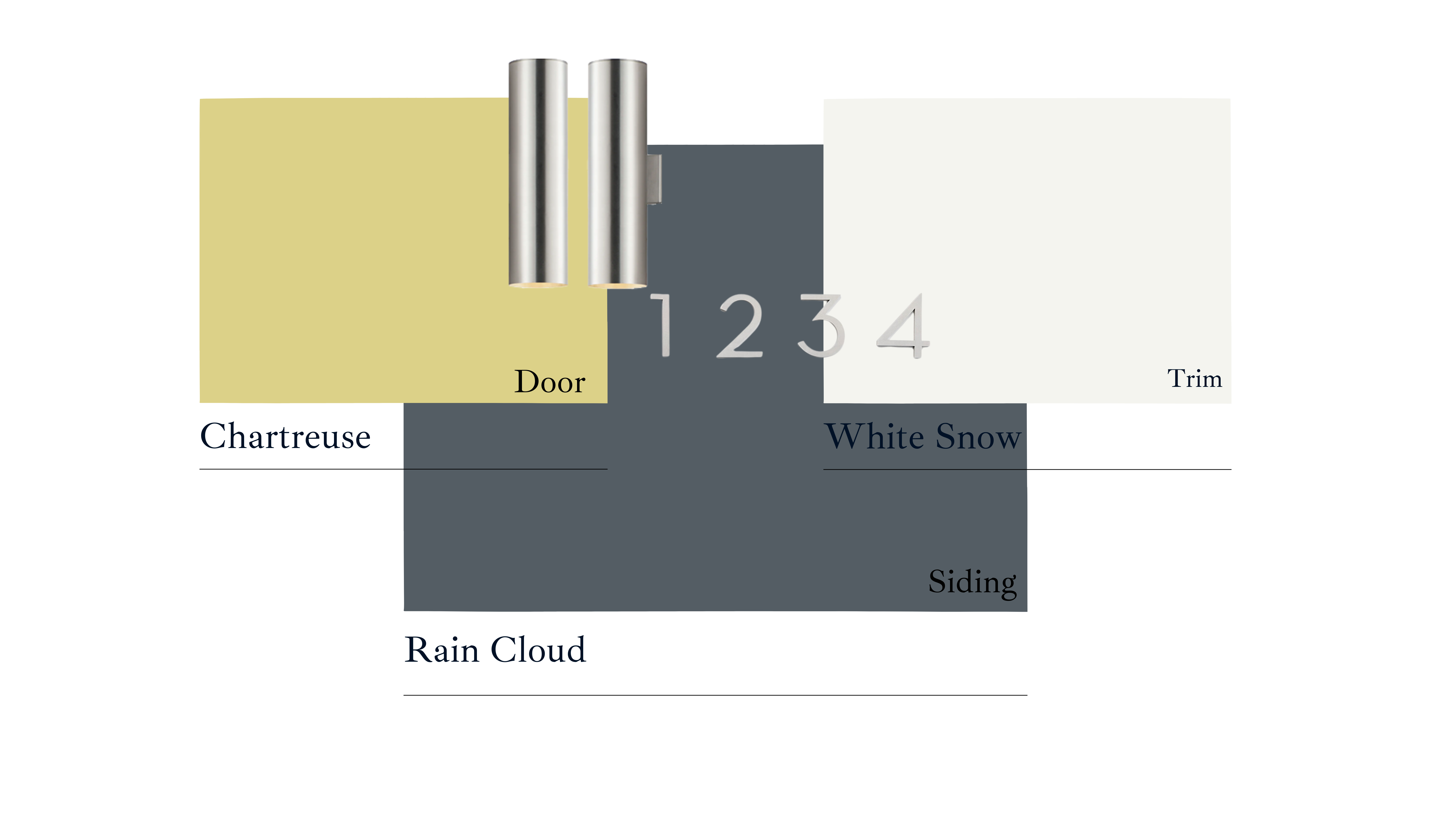
On exteriors, shades like Grounded, Malabar, and Bosque Pear evoke a rustic, mountainous charm, ideal for homes surrounded by natural landscapes. For a more traditional aesthetic, consider pairing Rain Cloud, a soft blue-gray, with the bright, clean contrast of White Snow for trim. This classic combination offers a sophisticated and timeless look. To add a pop of personality, introduce Mauve Finery or Chartreuse for a bold, eye-catching front door that elevates your curb appeal!
“Our Color capsule of the year can be curated to stand out with any style. We wanted a modern fresh take on color, with a balanced and usable assortment of shades” – Sherwin Williams
Dzinly’s color palette:
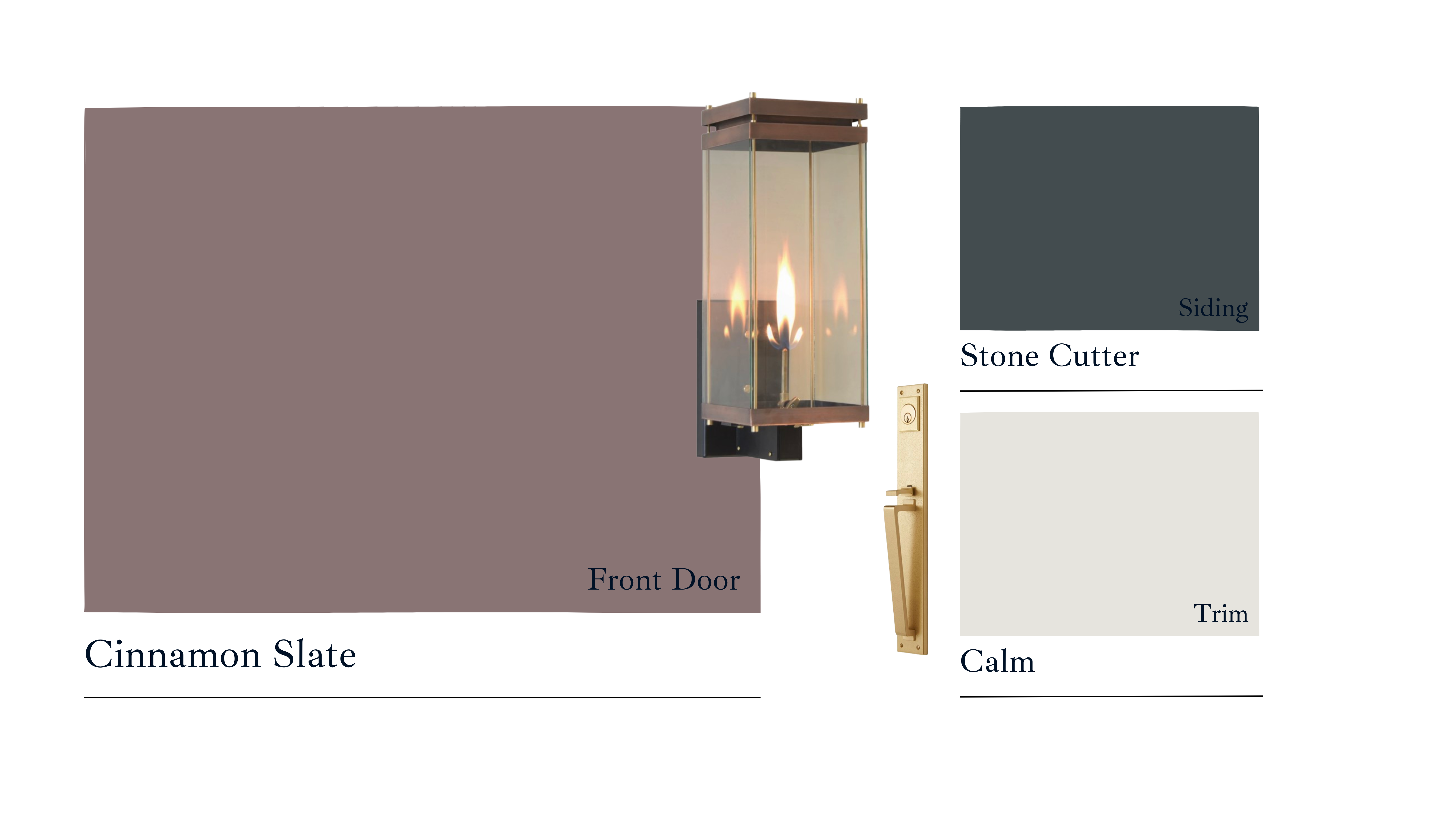
Benjamin Moore: Cinnamon Slate
_1733848095.png)
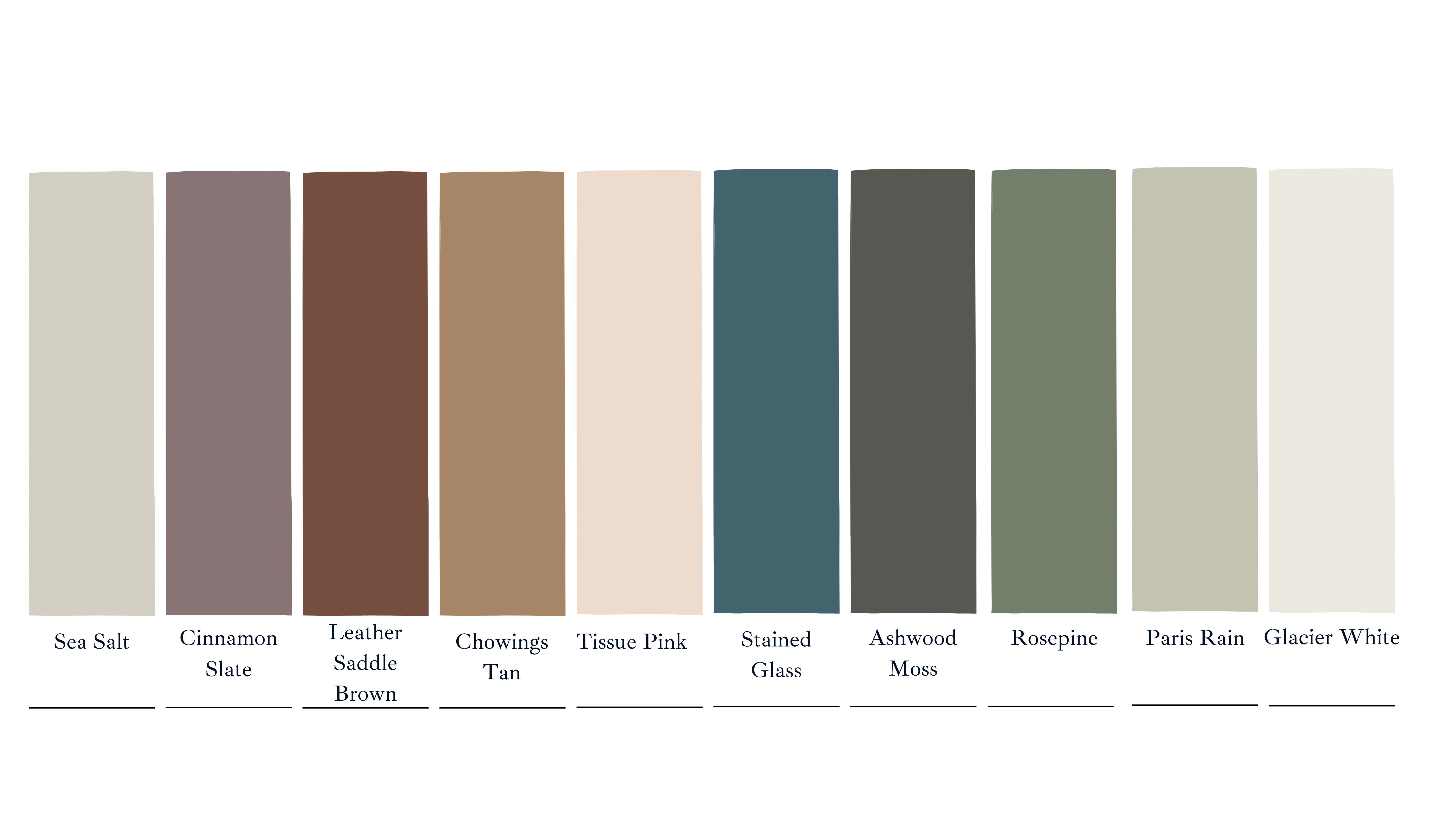
Cinnamon Slate is a rich blend of heathered plum and velvety brown. It is part of Benjamin Moore’s larger 2025 trend palette that includes versatile tones like Tissue Pink and Ashwood Moss, offering both bold and subtle options?.
For interiors, Cinnamon Slate shines in monochromatic schemes, enveloping rooms in a serene yet striking ambiance. Its richness also makes it perfect adding depth and dimension to walls while creating a soothing atmosphere.
On exteriors, Cinnamon Slate can elevate curb appeal, especially as a front door color. Pair it with whites that have hints of gray like Benjamin Moore’s Cloud White or Clam, or with deeper hues like Stone Cutter, or Kendall Charcoal to achieve a contrasting look. It also goes well with warm neutrals and soft greiges, such as Revere Pewter or Gray Owl, for a balanced and inviting exterior palette.
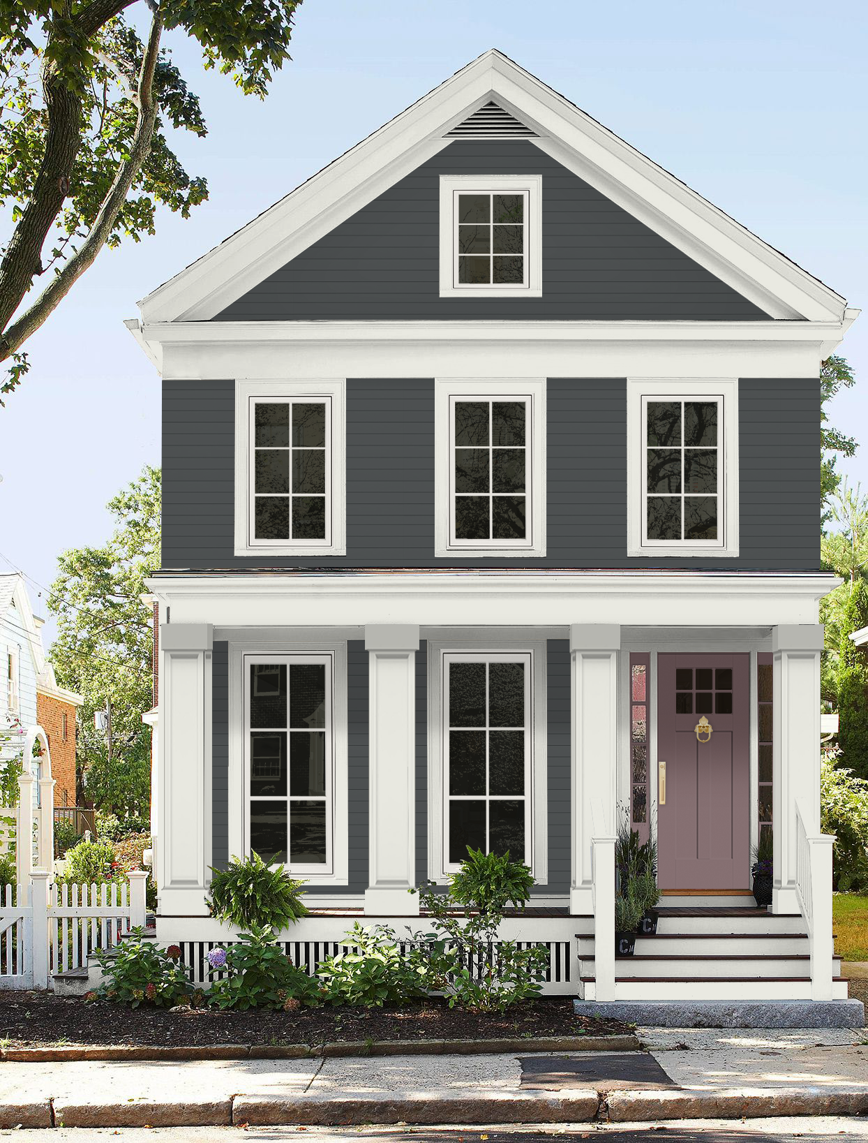
“This delicate mix of heathered plum and velvety brown offers enduring style and a modern sensibility.” – Benjamin Moore
Dzinly Color Palette:
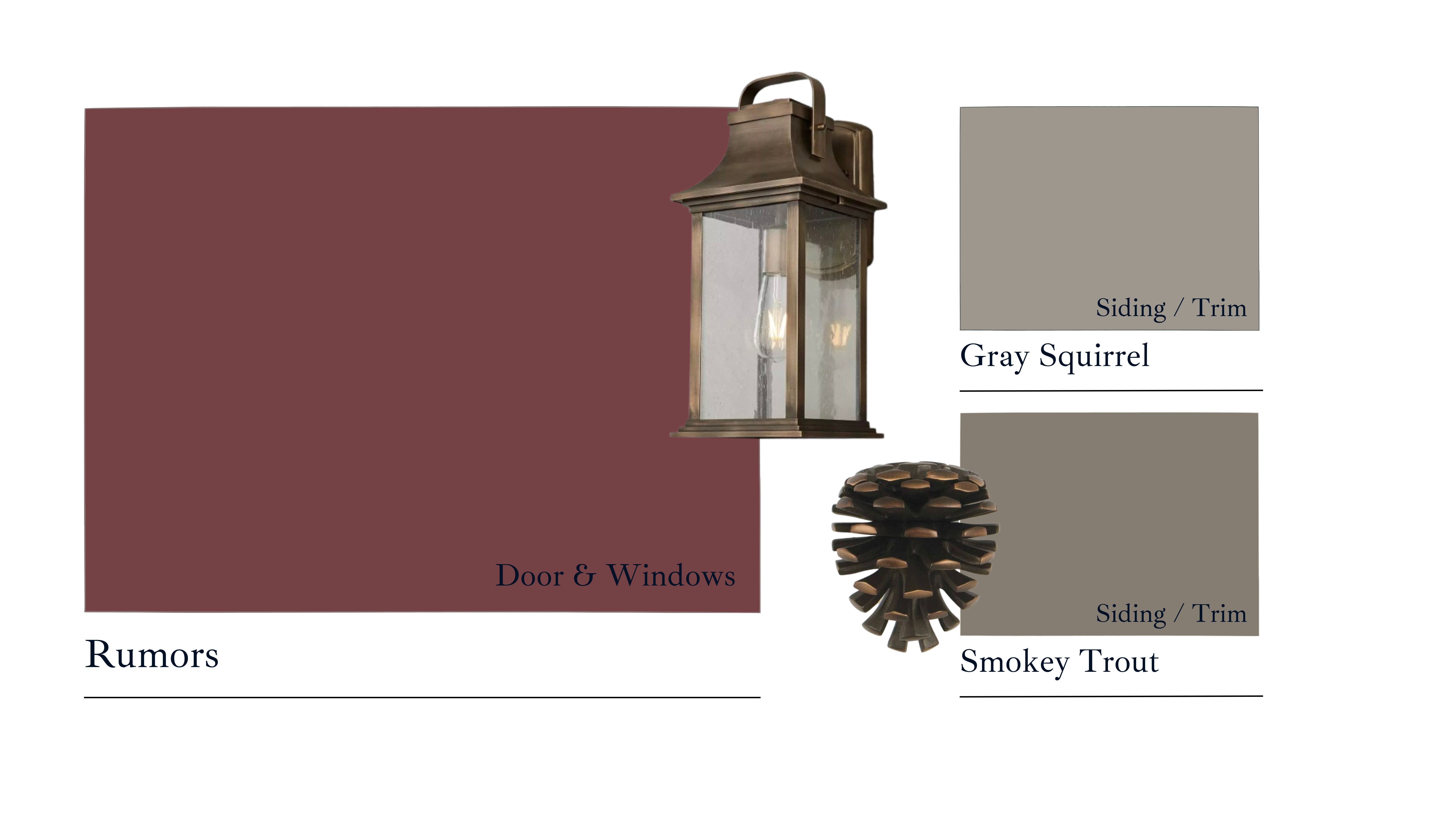
Behr: Rumors
_1733848564.png)
Rumors is a rich ruby red with subtle bluish undertones, offering a bold yet refined choice for creating dramatic interiors. Its depth and elegance make it a stunning option for spaces like offices or bathrooms, where you want to make a statement with color.
For exteriors, Rumors is a timeless red that adds character and charm, making it perfect for a colonial-style front door or a bold accent on windows and trim in a Craftsman home. To achieve a cohesive and inviting palette, consider pairing it with soft neutrals like Swiss Coffee or Pale Almond, which soften the boldness while maintaining a classic aesthetic. For an earthy and harmonious Craftsman-style vibe, deep greens such as Sequoia or Thyme Green create a connection to natural surroundings.
Alternatively, for a modern yet grounded look, rich neutrals like Gray Squirrel and Smokey Trout provide a sophisticated contrast, enhancing Rumors’ warm undertones while keeping the overall design elegant and timeless. These combinations balance boldness with subtlety, offering versatility across architectural styles
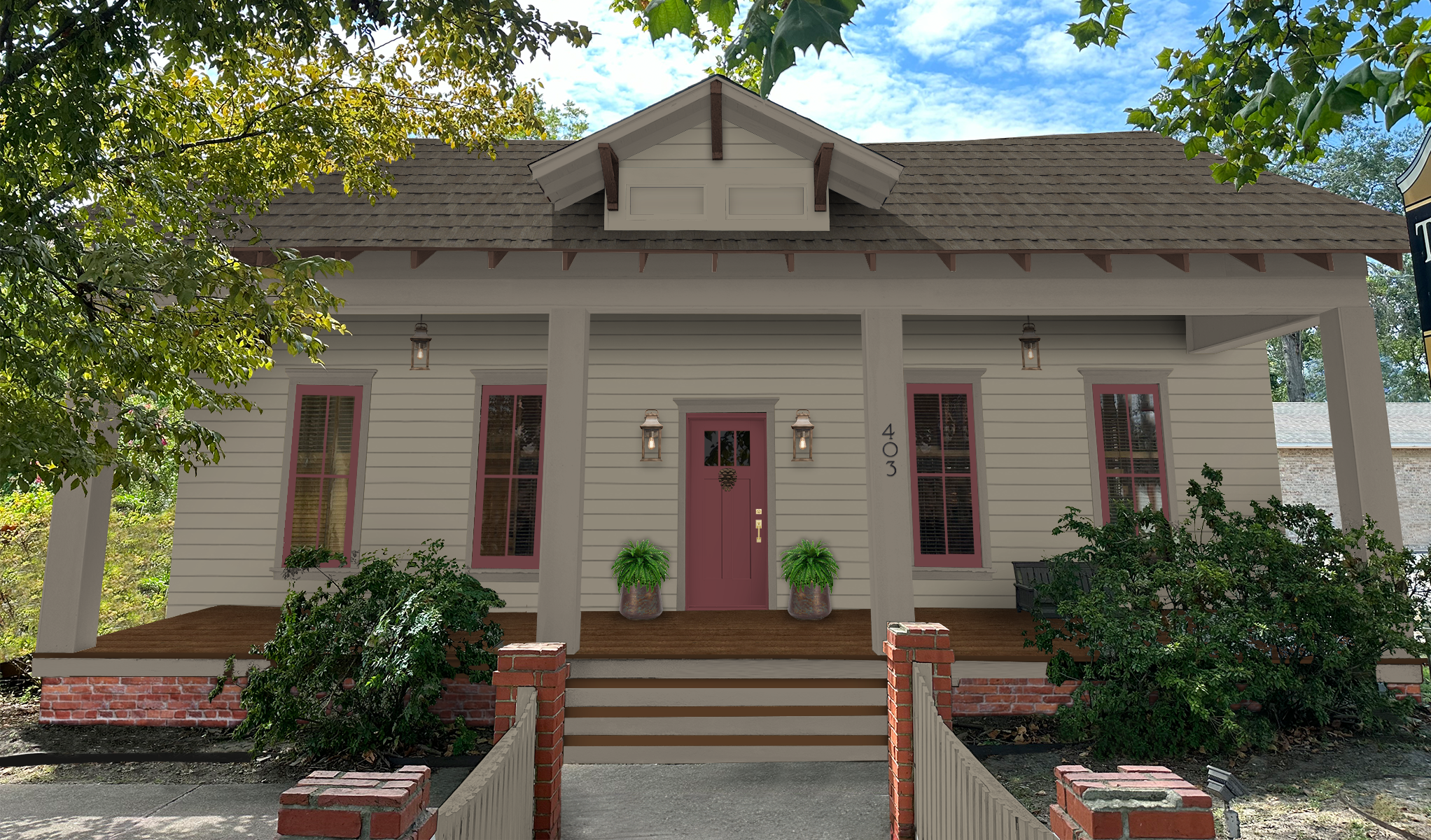
“Rumors is a luxurious ruby red adding warmth and rich allure.” – Behr
Dzinly Color Palette:
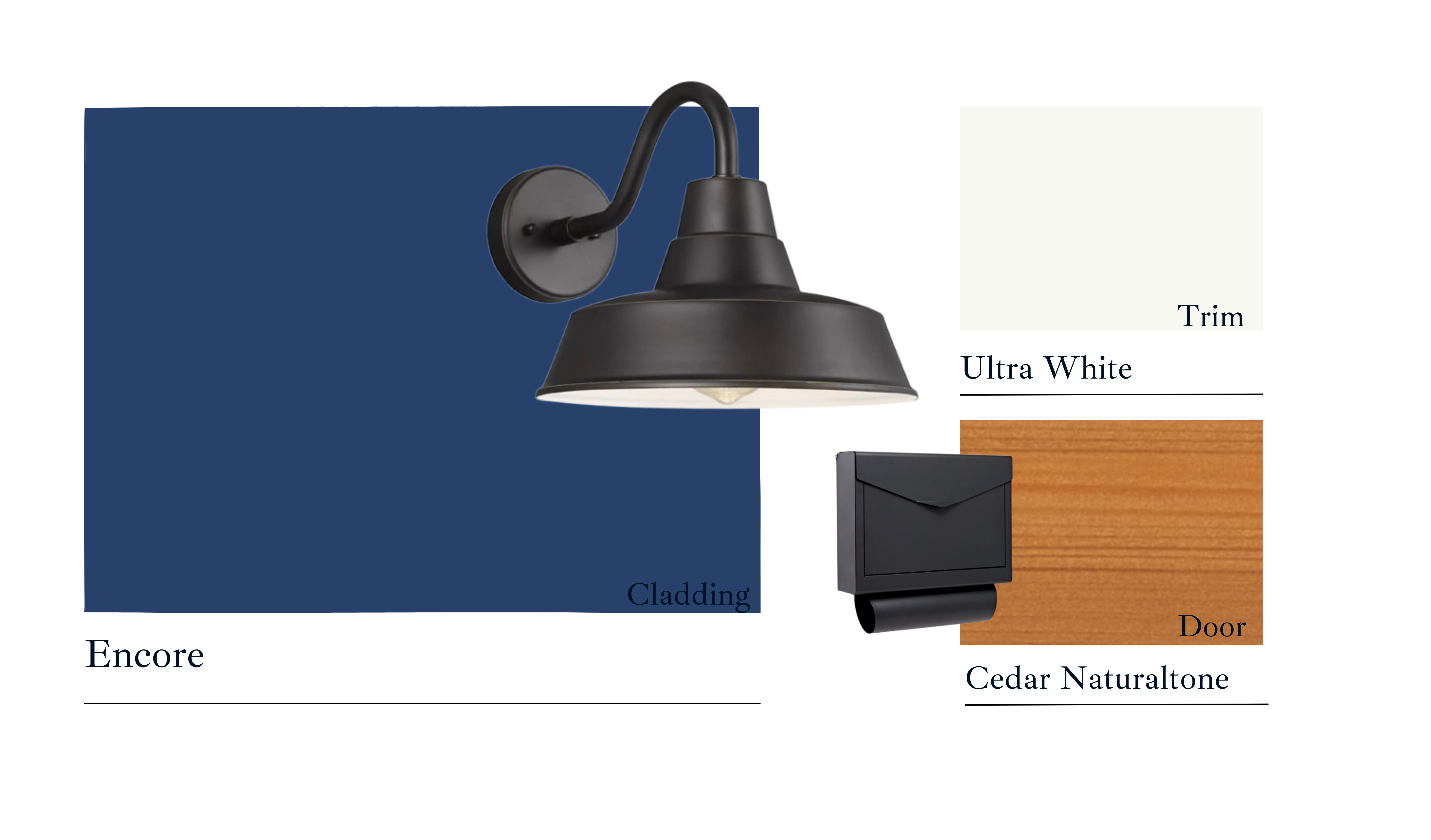
 Valspar: Encore
_1733848519.png)
Encore is a striking choice for both interior and exterior applications, capturing the essence of this year’s trending jewel tones. Unlike many other shades we have seen this year, Encore ditches the gray or smoky undertones and stands out with its unapologetically bold and vibrant presence.
For interiors, Encore is undeniably dynamic, making it an excellent choice for spaces that demand attention, such as an office or a bold accent wall. Encore could also work as the perfect stand-out color for your company’s new logo!
On exteriors, Encore shines as a front door color on modern facades, adds a vibrant twist to a red, white, and blue colonial, or serves as an energetic cladding color when paired with warm, orangey wood tones and bright whites for balance. This color will make a statement wherever it’s used!
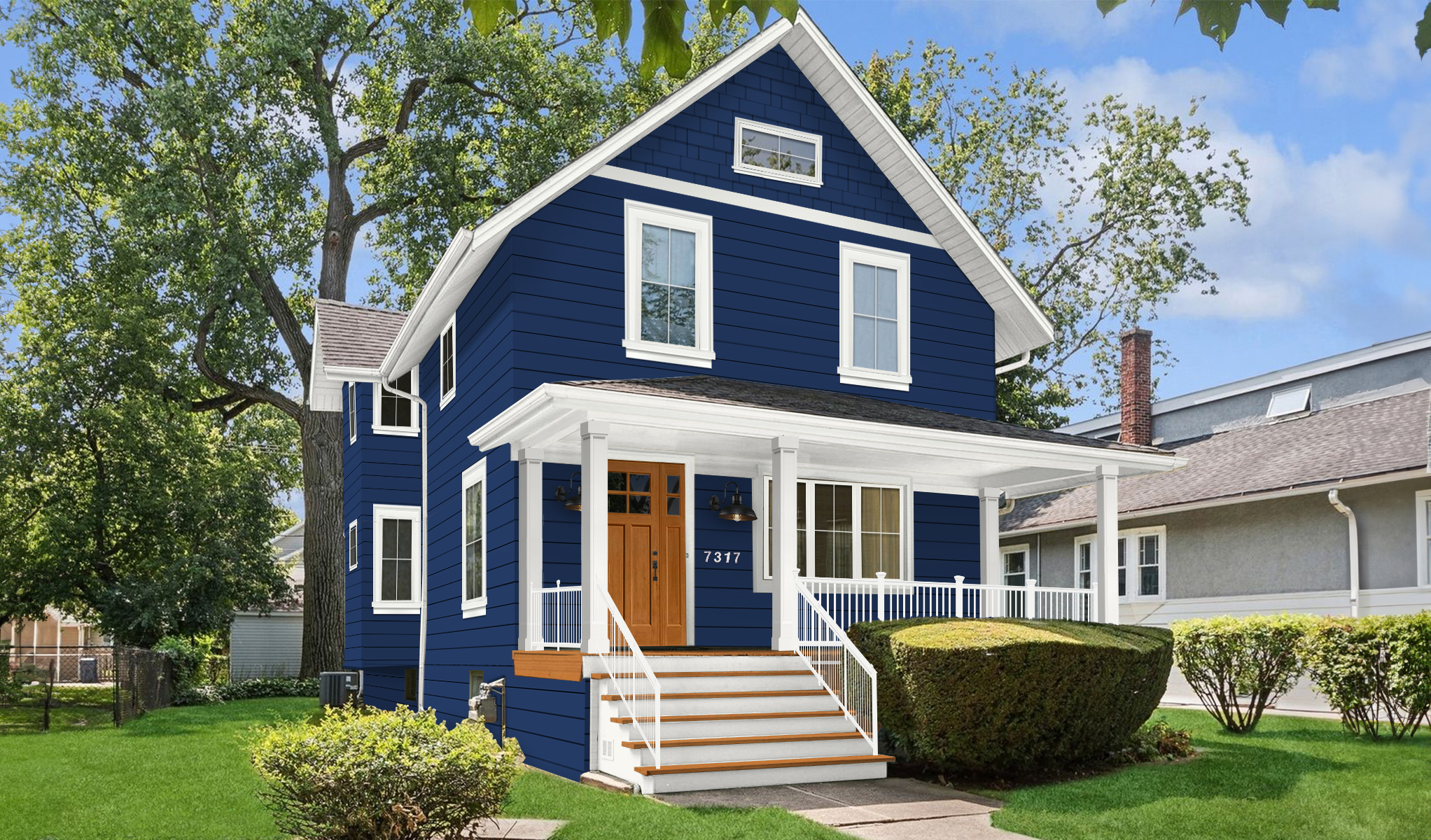
“This atmospheric blue is at home anywhere, and the rich color will have you coming back again and again.” – Valspar
Dzinly Color Palette:
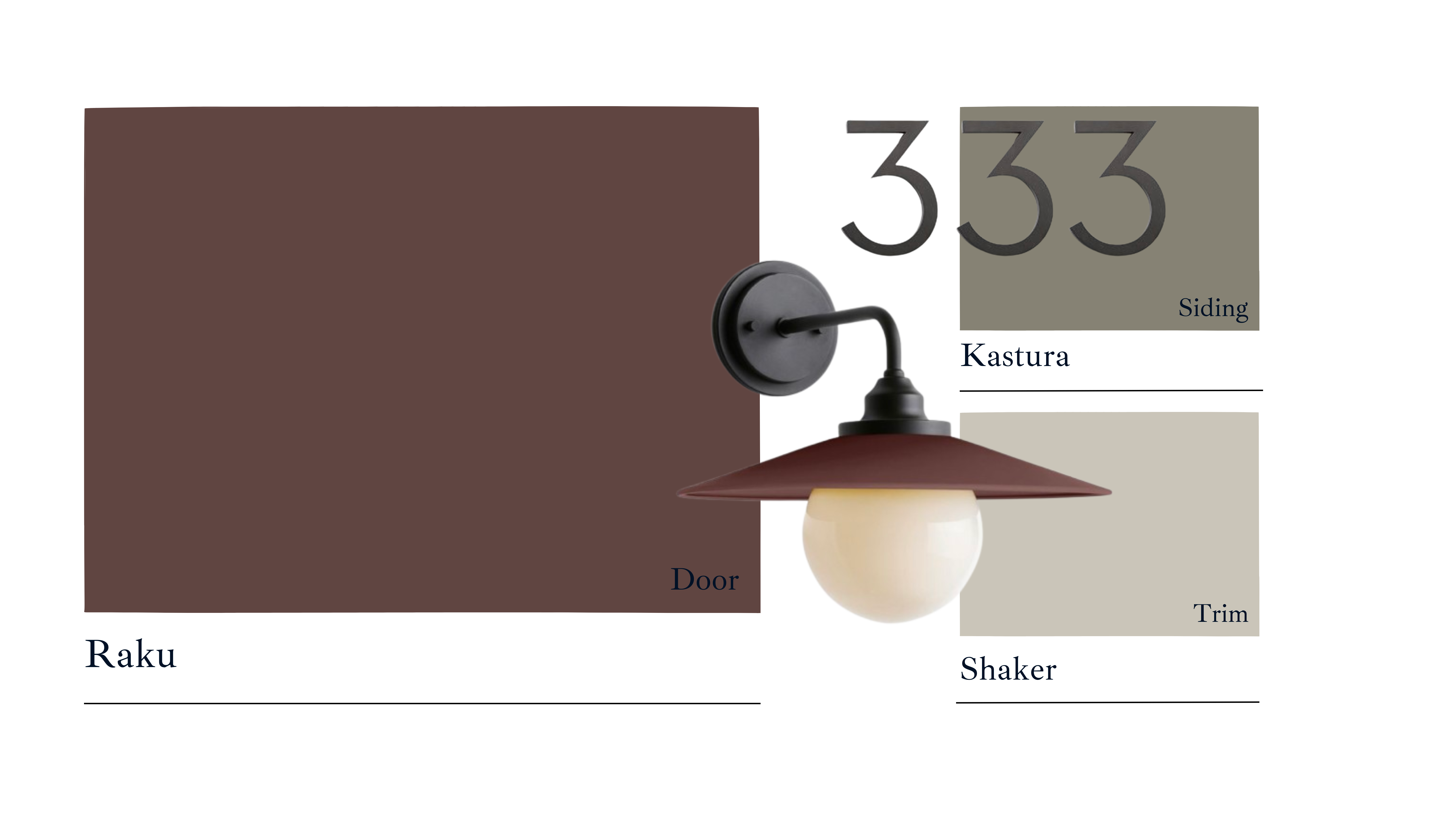
 C2 Paints: Raku
_1733848575.png)
Raku is a stunning brown-burgundy hue with subtle hints of purple and earthy undertones. Its rich, moody vibe makes it perfect for smaller spaces that deserve a bold touch, like a cozy bedroom or an eye-catching home office. It’s a color that effortlessly adds drama and depth wherever it’s used.
For exteriors, Raku makes a stunning front door color, especially when paired with a rich yet light green exterior or neutral greige tones. It also works wonderfully as an accent color for Craftsman-style windows or architectural details, offering a timeless and sophisticated look. Additionally, Raku is an excellent choice for cladding a home situated in natural surroundings. Its muted and earthy undertones blend seamlessly with wooded or mountainous landscapes, creating a harmonious and understated connection to nature. This makes it ideal for homeowners looking to enhance their property’s integration with the environment while maintaining a modern and stylish facade.
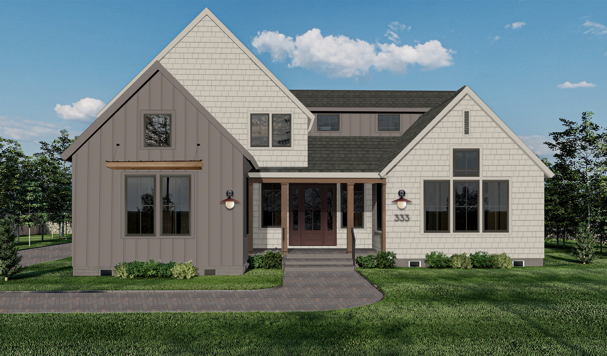
“It’s a true chameleon color shifting between an oxidized sanguine to a dark burgundy with subtle purple and brown undertones, evoking an aura of sophistication and warmth.” – C2
Dzinly Color Palette:
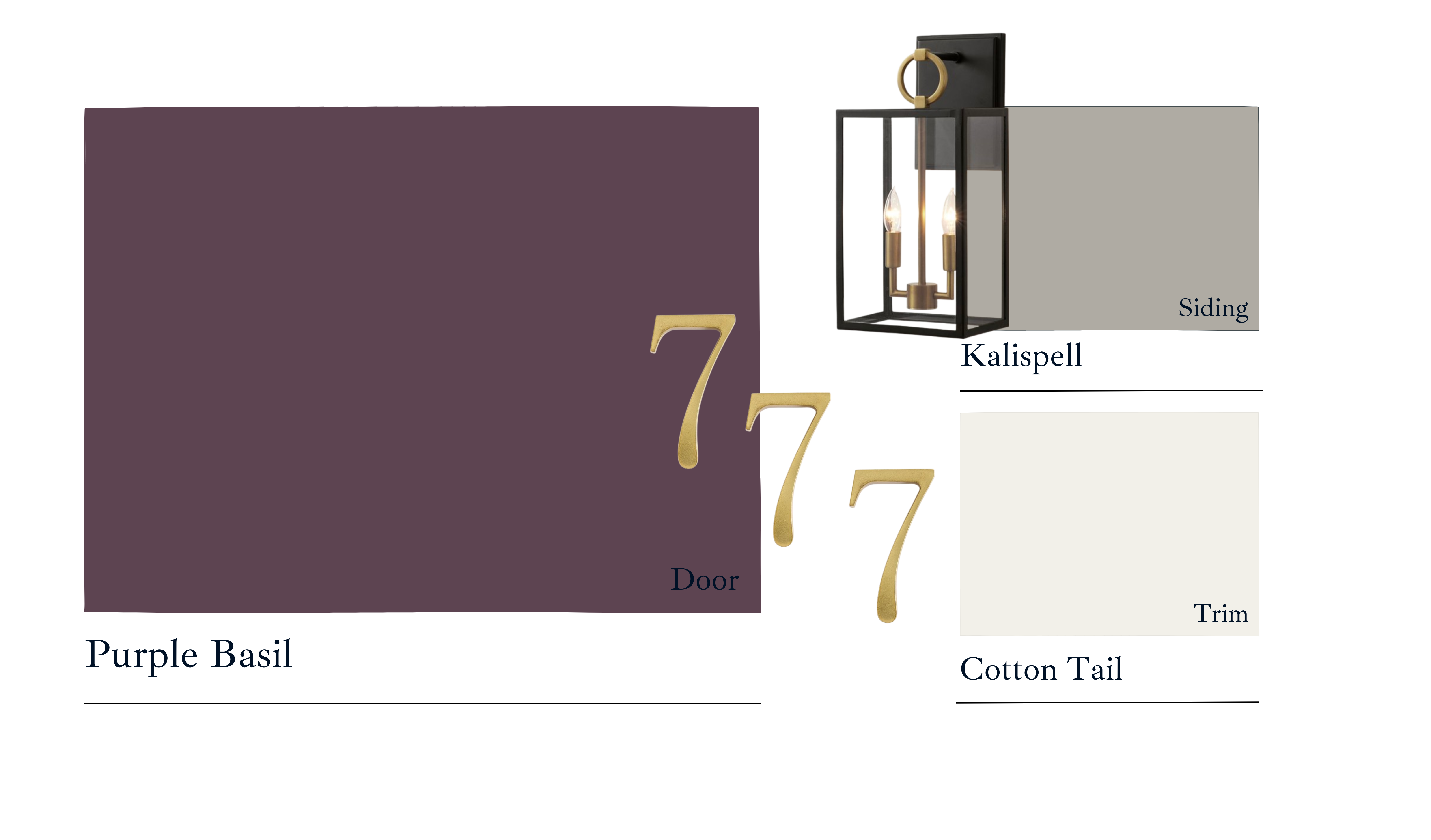
PPG: Purple Basil
_1733848618.png)
Purple Basil is a rich, classic deep purple that balances warmth and calm for a timeless, elegant feel. Its historical charm makes it a standout choice for those seeking a color that’s both bold and refined.
For interiors, Purple Basil creates a dramatic and moody vibe, making it ideal for cozy and atmospheric spaces like libraries, bedrooms, or accent walls. Its depth adds sophistication while maintaining a sense of calm, perfect for intimate or creative environments.
On exteriors, Purple Basil makes a striking statement when used as a front door color. Pair it with warm gray siding, silky white trim, and gold accents for a sophisticated and eye-catching finish. For those seeking a bolder approach, Purple Basil can also be used as a cladding color, offering a unique and refined facade that stands out while maintaining elegance. It pairs beautifully with neutral trim colors like soft whites or light grays to create balance and complements natural materials like stone or wood accents for an earthy yet luxurious look.
_1733848663.png)
“This captivating hue strikes a perfect balance between the calming qualities of blue and energetic warmth of red. It is highly adaptable and easily paired with a wide array of palettes and colors while offering a sense of rarity.” – PPG
Dzinly’s color palette:
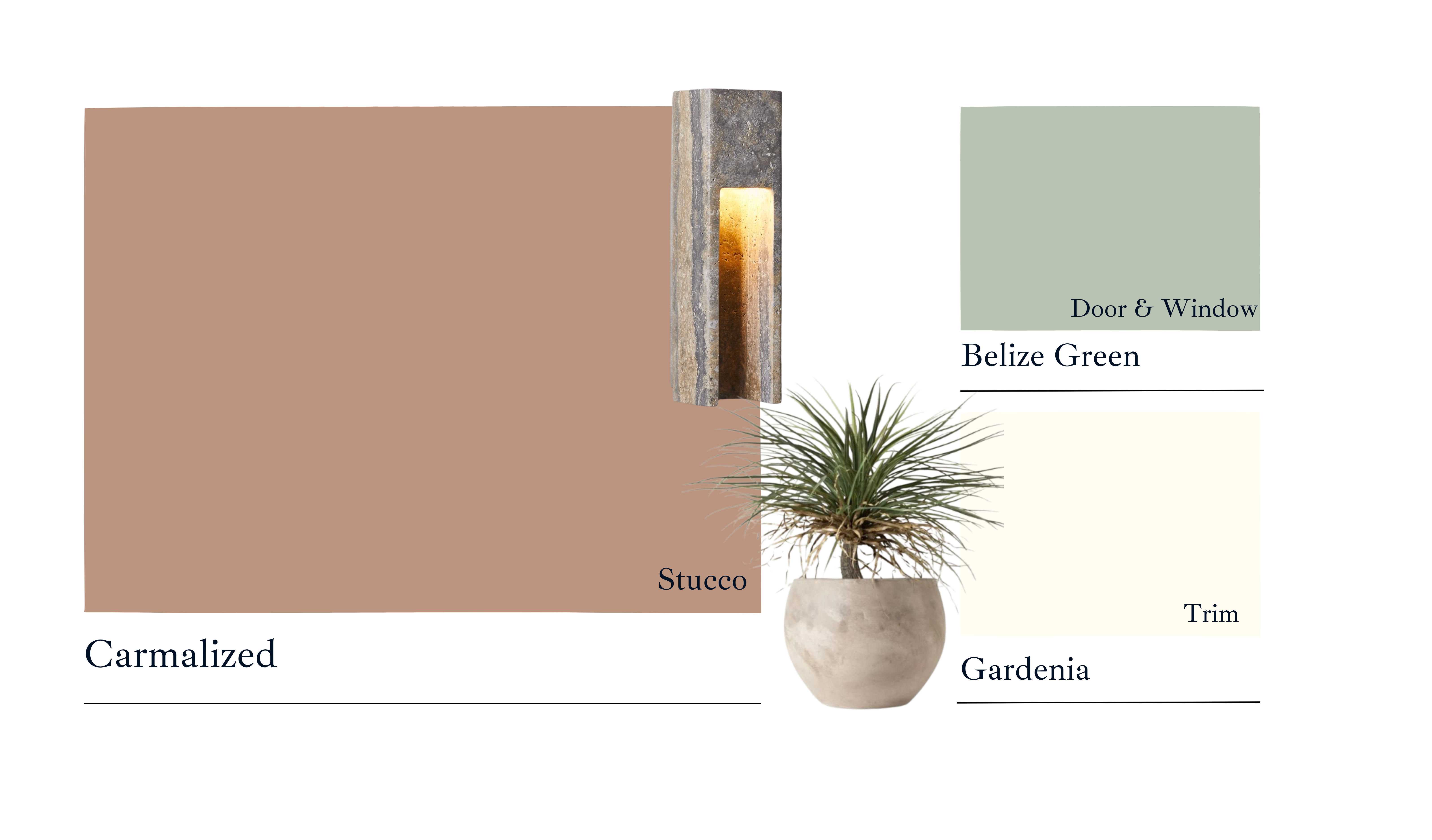
Dunn Edwards: Caramelized
_1733849129.png)
Carmelized, Dunn Edwards’ Color of the Year, is a light and inviting golden caramel hue with subtle peachy undertones, giving it a unique balance of warmth and freshness.
For interiors, Carmelized is ideal for crafting cozy, welcoming environments. It pairs beautifully with warm wood finishes and earthy tones, making it a perfect addition to living rooms, dining spaces, or any area that invites relaxation and connection.
On exteriors, Carmelized truly shines on stucco facades, especially when complemented by a cool accent color and a soft, warm white trim. The combination creates a fresh yet grounded aesthetic that’s effortlessly stylish.
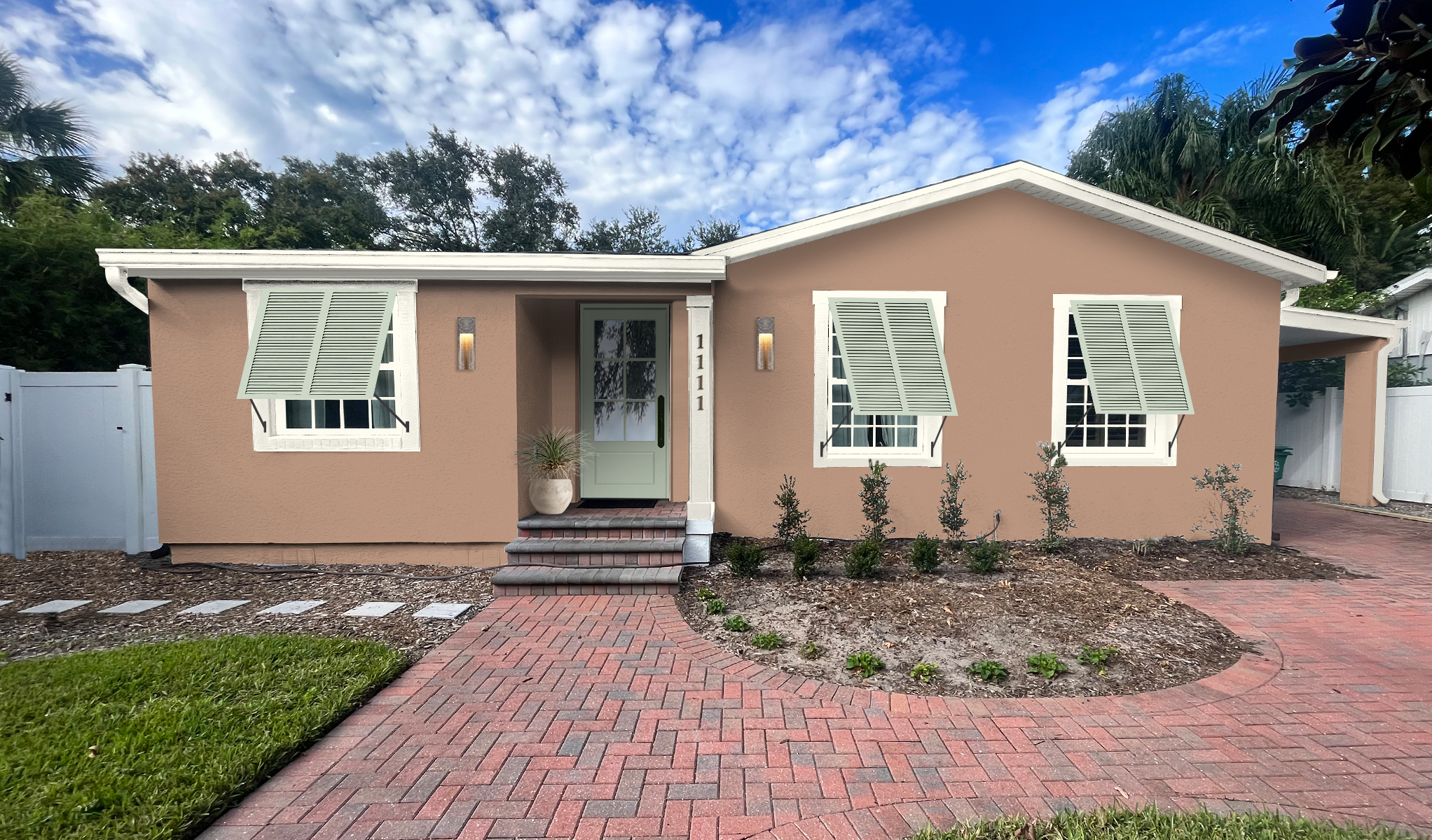
“The Ultimate Neutral” – Dunn Edwards
Dzinly Color Palette:
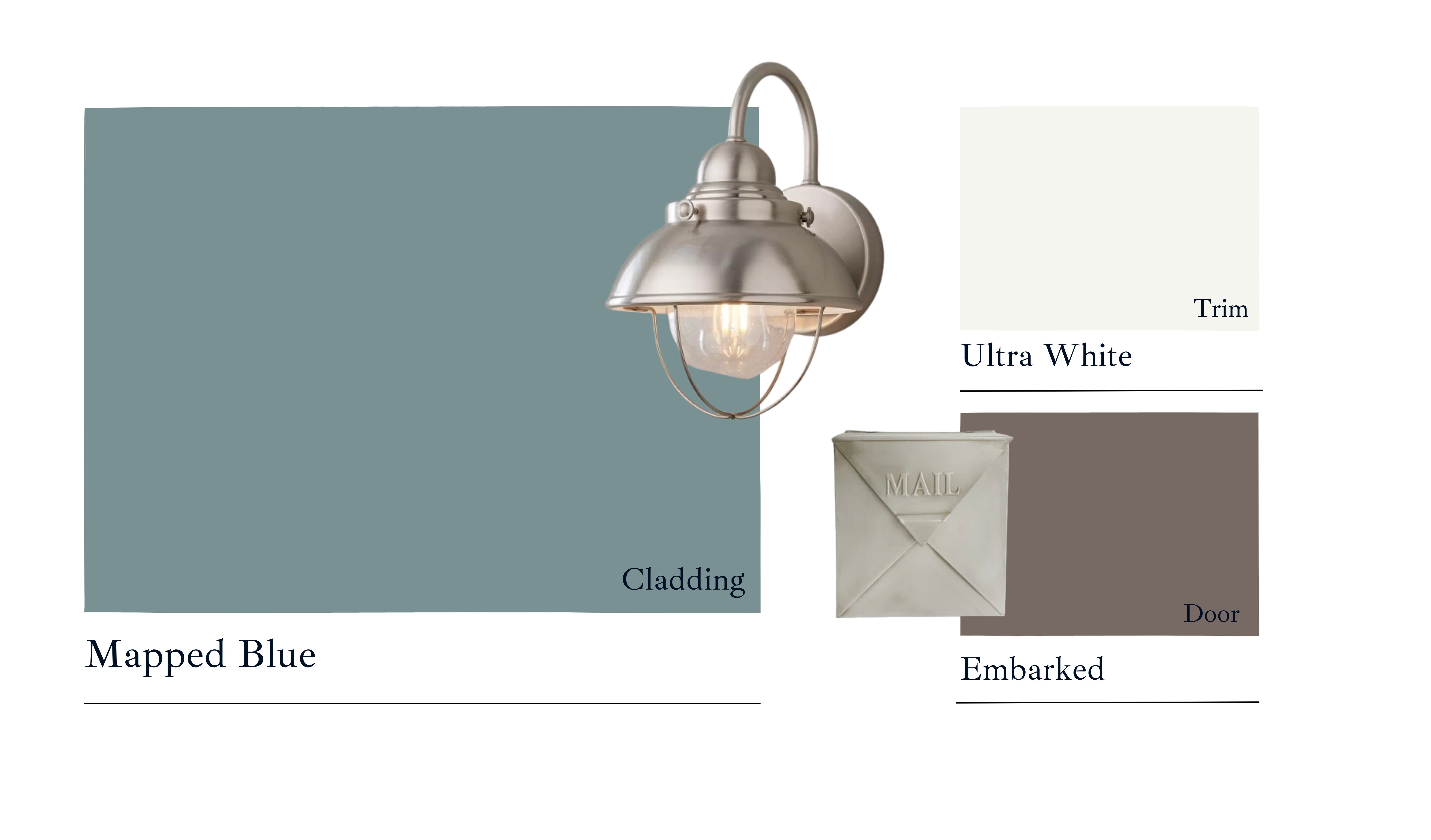
Dutch Boy: Mapped Blue
_1733848829.png)
Dutch Boy Paints’ Mapped Blue is a versatile medium blue with subtle yellow undertones, giving it a soft warmth. This quality allows it to bridge classic and modern aesthetics, making it suitable for both traditional and contemporary designs. The yellow undertones create a welcoming and soothing vibe, while the overall blue tone provides a sense of stability and timelessness. This makes Mapped Blue feel grounded yet fresh, ideal for promoting relaxation and comfort in a space.
For interiors, Mapped Blue is perfect for creating calming and inviting spaces. It pairs beautifully with wood furniture and brass accents, making it an excellent choice for living rooms, bedrooms, or any area meant for relaxation and connection. Its warm undertones allow it to work as a grounding wall color or a subtle accent in various interior styles.
On exteriors, Mapped Blue excels as a versatile choice for modernizing facades, especially when paired with natural materials like wood, stone, or brick. Complementing it with a warm white trim or earthy accent tones can create a timeless and polished curb appeal that feels fresh and grounded
“Mapped Blue helps set a timeless foundation in your home, staying on-trend as your personal style evolves. A beautiful, medium-tone blue with slight yellow undertones, it adds modern charm to any space.” – Dutch Boy
Dzinly Color Palette:
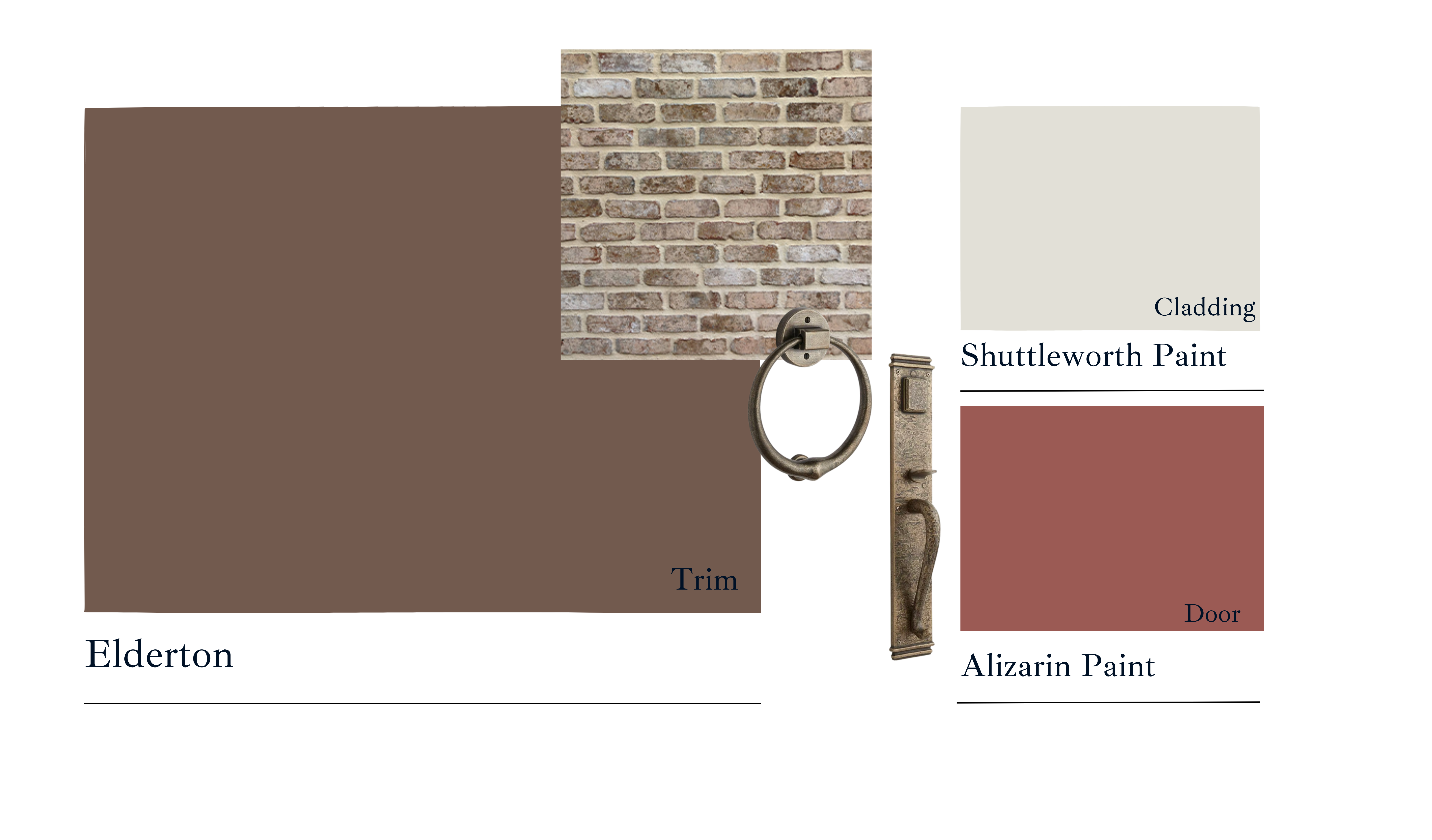
Graham & Brown: Elderton
_1733848900.png)
Graham & Brown’s Color of the Year 2025, Elderton, is a rich, warm brown that exudes sophistication and timelessness. Its deep, earthy undertones create a grounded and cozy vibe, making it ideal for both traditional and modern spaces. The color evokes warmth and intimacy, often described as elegant and refined, with the ability to add depth and texture to any room.
The mood of Elderton is inspired by natural and historical elements, such as the charm of the English countryside and neoclassical aesthetics. It’s particularly suited for creating inviting interiors with a focus on warmth and comfort while maintaining a luxurious feel. Elderton pairs beautifully with natural materials like wood and soft neutrals, enhancing its versatility.
For interiors, Graham & Brown’s Elderton, a sophisticated and rich neutral brown, is perfect for creating cozy and refined spaces. Its deep, earthy tone pairs beautifully with natural materials like wood and neutral accents, making it an excellent choice for living rooms, dining areas, or bedrooms where warmth and elegance are desired. This shade is particularly suited for accent walls or as part of a “color drenching” technique for enveloping a space in its inviting charm.
On exteriors, Elderton’s timeless and grounded nature complements traditional architecture, particularly on brick or stucco facades. Pair it with cream or soft white trims to highlight its depth, creating a look that feels both modern and connected to nature
Dzinly Color Palette:
“Elderton is a stunning plant with some varieties having almost deep brown leaves which is where our Elderton Hue comes from. This timeless and charming shade is a perfect neutral toned brown which will never go out of fashion.” – Graham & Brown
Finally, let’s take a look at Dzinly’s color Palette of the year.
_1733848978.png)
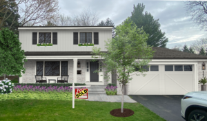
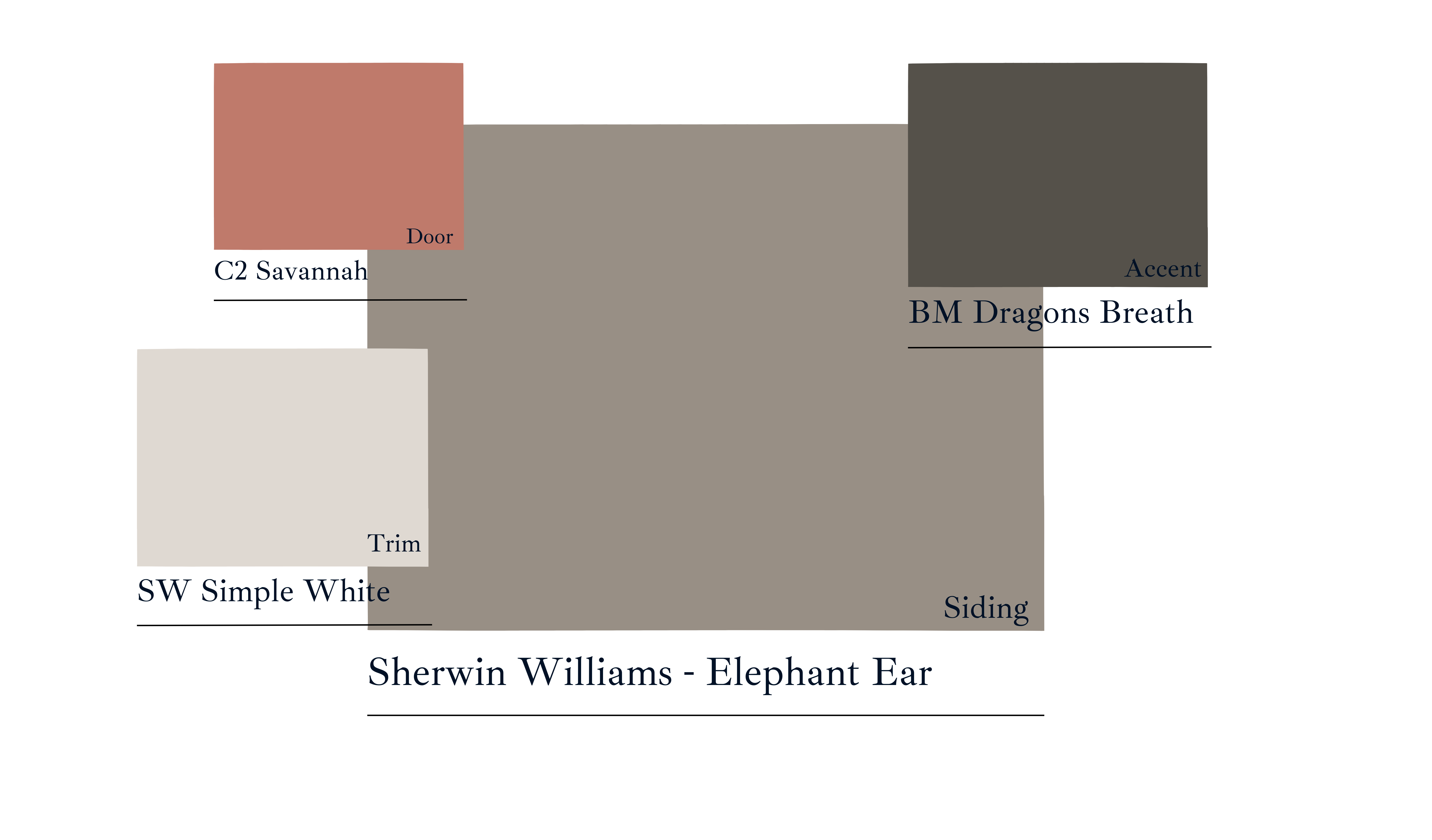 The Perfect Color for any Home:
Elephant Ear brings a soothing, neutral vibe with earthy tones that blend beautifully with various home styles. Featuring warm taupe and soft gray undertones, this shade offers a balanced and refined look, making it an excellent choice for exterior siding or trim. As Bella Baldwin, a Dzinly Designer, explains, “Elephant Ear is a timeless neutral that creates a welcoming foundation for any home. Its subtle warmth enhances the architectural details while letting bold accent colors truly shine.” This versatile color adds both depth and warmth to your home’s facade, ensuring a polished, cohesive exterior.The Perfect Soothing White:
SW Simple White is a clean, crisp white with a slight touch of warmth, giving it a fresh and soft feel without being too stark. This color works exceptionally well on exteriors because it can open up spaces, reflect light, and provide a clean, timeless backdrop. It pairs perfectly with bold accent colors or natural finishes, making it ideal for homeowners looking for a serene and welcoming look?
A Sophisticated Accent We Always Love: Benjamin Moore Dragon’s Breath
This rich, deep charcoal has undertones of brown, which gives it a grounded, elegant feel. It’s dark without being too harsh and adds a refined, sophisticated touch to any home. Dragon’s Breath is perfect as an accent color, especially for doors, shutters, or trim. It offers a striking contrast when paired with lighter walls, creating a bold and timeless statement. As Bella puts it, “Dragon’s Breath is my go-to when a client is looking for a moody, interesting vibe. It’s bold yet approachable, making it a standout choice for adding drama and sophistication to a home’s exterior.”
A Fun Pop of Color That’s Versatile: C2 Savannah
Savannah (C2-543) is a warm coral that works beautifully across a range of exterior home styles, including Colonial, Craftsman, and Mid-Century Modern. Its rich hue pairs well with neutral tones like beige, grays, and blues, making it a versatile accent color. In Colonial homes, it adds a lively touch when paired with muted tones. For Craftsman exteriors, it contrasts nicely with earthy greens or deep grays, while in Mid-Century Modern homes, it complements sleek whites and neutrals, offering a vibrant, yet sophisticated pop of color. As Baldwin explains, “Savannah is perfect for clients who want to incorporate personality into their home’s exterior. Its warm coral tone adds just the right amount of energy while maintaining a classic, polished look.”
Dzinly co-founder Jackie Mosher adds, “We chose a realistic palette that’s not too wild and can be used across a wide range of exteriors, ensuring these colors will not only look amazing but will also be loved for years to come.”
The paint colors for 2025 reflect a significant shift toward deeper, earthy tones that evoke comfort, sophistication, and a sense of timelessness. These selections align with a growing preference for spaces that feel personal and grounded, drawing on rich shades inspired by nature, spices, and gemstones. For example, Glidden’s Purple Basil and Minwax’s Violet offer bold yet sophisticated jewel tones, while brands like Sherwin-Williams and Valspar have chosen hues like Quietude and Encore, which blend calming, neutral tones with modern vibrancy. These colors reflect a desire for more enduring and versatile designs, promoting spaces that combine tranquility with bold, expressive accents. With this palette, homeowners are encouraged to embrace spaces that tell personal stories, mixing warmth, relaxation, and the possibility of dramatic flair.
If you’re inspired by any of these brand-favorite Colors of the Year and want to see how they would look on your own home, Dzinly can help! With our easy-to-use platform, you can visualize these stunning shades on your exterior before committing, ensuring your home reflects your style and vision perfectly. Let Dzinly take the guesswork out of color selection and help you create a home you’ll love for years to come!
Discover more tags
Popular Posts
View All-

Emerging Trends in Home Construction and Renovation
Image source In the dynamic world of home construction and renovation, staying updated with the latest trends is essential for homeowners, builders, and designers. As we move deeper into 2024, several innovative trends are emerging, driven by technological advancements, sustainability concerns, and evolving aesthetic preferences. This blog will explore these trends, providing insights into what’s […]
-
Best Practices for Client Communication and Project Management
Image Source For design and construction, effective client communication and project management are key pillars that can make or break a successful project. From understanding client needs to delivering a finished product, every step requires clear communication and efficient management. Here are some best practices to ensure a smooth and successful journey from project initiation […]
-
Why Isn’t Your Listing Selling? Actionable Steps for Real Estate Agents
Selling a home should be a smooth process, but sometimes listings sit on the market longer than expected. If a property isn’t generating interest or receiving offers, identifying the root cause is crucial. Here are common reasons why homes struggle to sell and actionable steps real estate agents can take to turn things around. Overpricing […]
-
The Impact of Weather and Climate on Building Projects: What You Need to Know & How to Manage It
When it comes to building projects, weather and climate are often overlooked factors that can significantly impact everything from timelines to budgets. Whether you’re constructing a new home, renovating a commercial property, or working on any kind of building project, understanding how the elements affect your plans is crucial for a successful outcome. In this blog, we’ll explore how weather and climate influence construction and offer practical solutions to manage these challenges.